
Here

 www.motor1.com

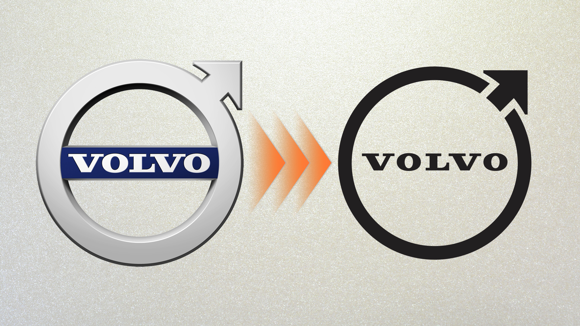
Volvo Sneakily Updates Their Logo, Takes The 'Minimalist' Route
Logo changes are a big deal. After all, it represents a brand's identity. However, Volvo didn't make much noise about it, in tune with the new minimalist look.
www.motor1.com
") Huge step backwards....
Huge step backwards....